Store Look Check · example
larelabs.com — mobile + desktop audit
This is the deliverable format we use instead of a pitchy Loom: real screenshots, three fixes, no fluff. We ran it on our own site first — captured 2026-05-30 via Playwright on production.
URL audited: https://larelabs.com/
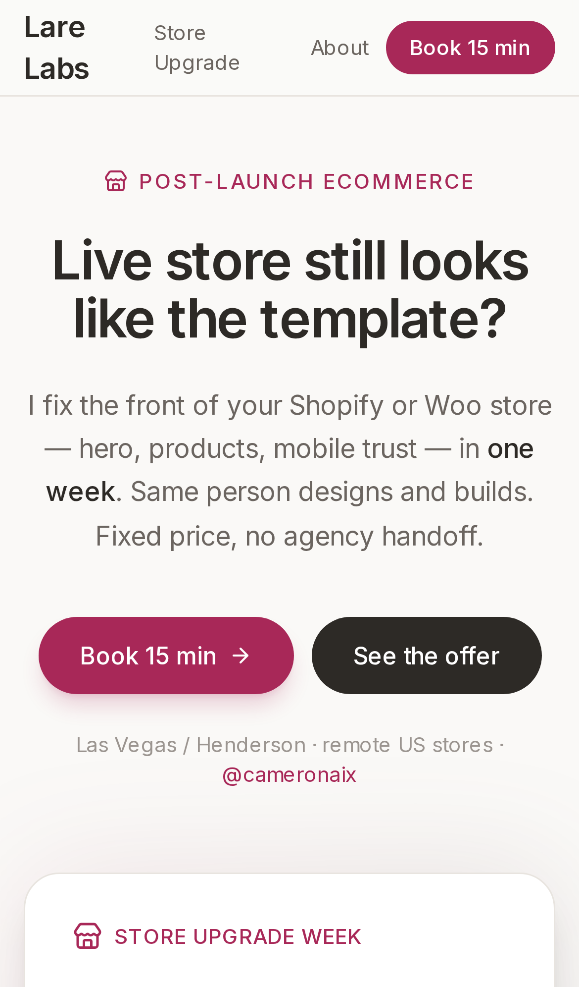
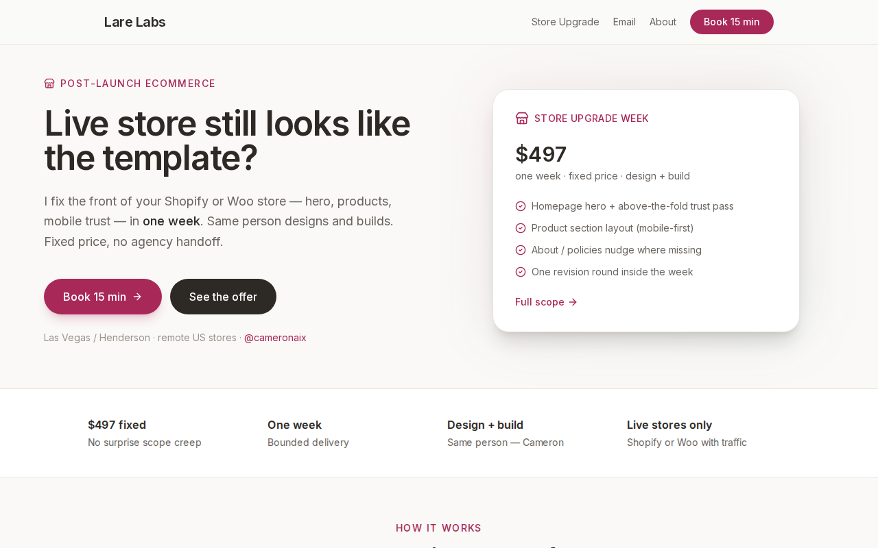
Three fixes (PM view)
- #1
Hero had zero visual proof
Offer copy was strong but strangers could not see what “store upgrade” looks like. Fix: screenshot audit + email spec samples on site.
- #2
Mobile nav hides “Store Upgrade” label context
Nav fits, but first-time visitors on phone only see logo + Book — consider sticky offer chip (future).
- #3
No live Shopify before/after yet
Honest gap until first paid client. Spec email work + sample deck show design craft; store panels ship after client #1.
Design craft proof (email lane)
Store before/after ships with client #1. Until then: spec email work shows layout, typography, and mobile discipline.
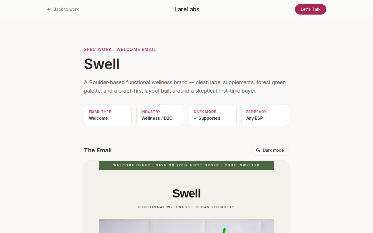
Spec work · not a paid client · shows production quality
Want this on your store?
Drop your live URL — same format, three fixes, no pitch in thread.